Joining GAIA Design team to help tackle UX and UI challenges.
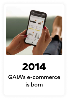
GAIA Design was founded in 2014 by Philippe Cahuzac, Hassan Yassine and Raffaello Starace, three friends with outstanding knowledge on international business. They recognized the great market potential Mexico represented and thus, they pioneered an e-commerce approach to start selling products middle upper-class Mexicans were lacking: tasteful, fashionably-designed affordable furniture for their homes and spaces.

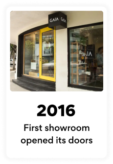
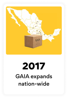
Some quick GAIA milestones through the years…
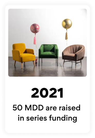
During late 2022, GAIA’s employee count surpassed 1000+ people.
As business expanded and requirements did too, I was fortunate enough to have joined their UX team as a Sr. UX/UI Designer in September 2022.
My contributions and every day tasks:
⭐ Creation of GAIA’s first ever Design System Figma components.
User flows, AB Testing and ticket task creation from abstract concepts for [usually already negotiated] product features.
Thorough collaboration with different stakeholder areas for implementation.
Benchmarking and soft UX writing.
Direct reports: 1 junior UX Designer.
GAIA’s Design System: Patchwork.
The Design Team saw a handful of designers through the years and I was given the AMAZING opportunity to build GAIA’s Design System Figma library components.
Albeit Design team’s past best efforts, the visual incoherences between files and a bit of chaos within versions and sizes made the design process slower and less efficient. Naturally, rolling up my sleeves was challenging — but also quite fun!
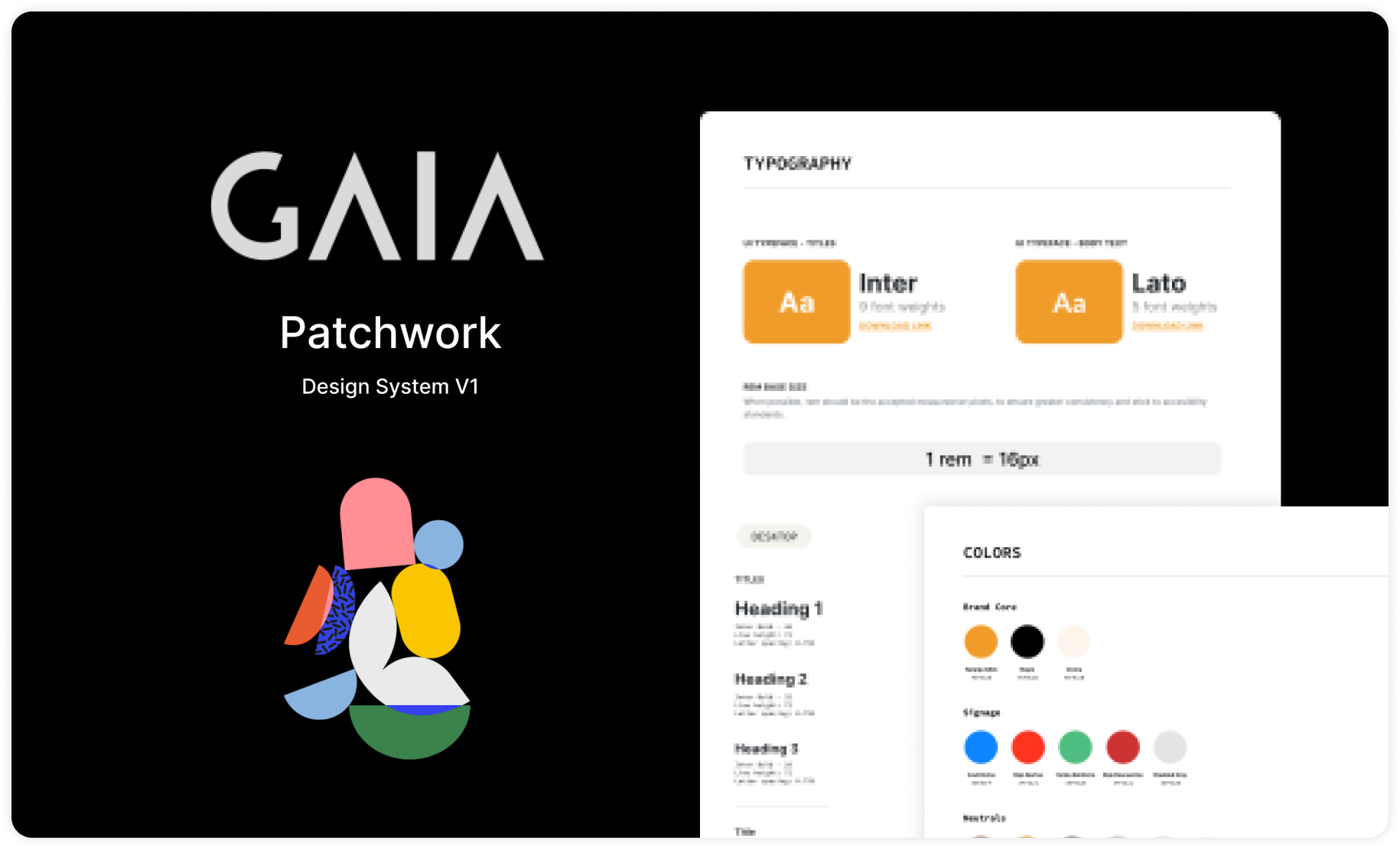
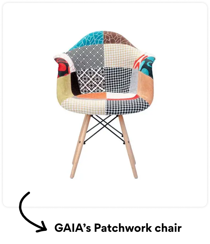
I believe giving a proper, personalized name to a Design System is always a much better alternative. One of GAIA’s top-selling products since they started in 2014, and still to date, is the iconic Patchwork Eames Chair.
The word “Patchwork” seemed like a perfect fit, given the fact that the definition of the word itself is “pieces of cloth of various colors and shapes sewn together to form a covering” . A Design System , in a way, is also composed by pieces of various elements to form a larger entity.
The building of Patchwork
Within my first week I immediately started to tackle the construction of GAIA’s Design System. I first learned the frameworks on top of which GAIA was built. Internally, we were maintaining two separate platforms and planning a migration to keep just one.
I did a thorough scan through the entire experience in order to map out all components needed and so I started to create the Design System based off of atomic design principles.
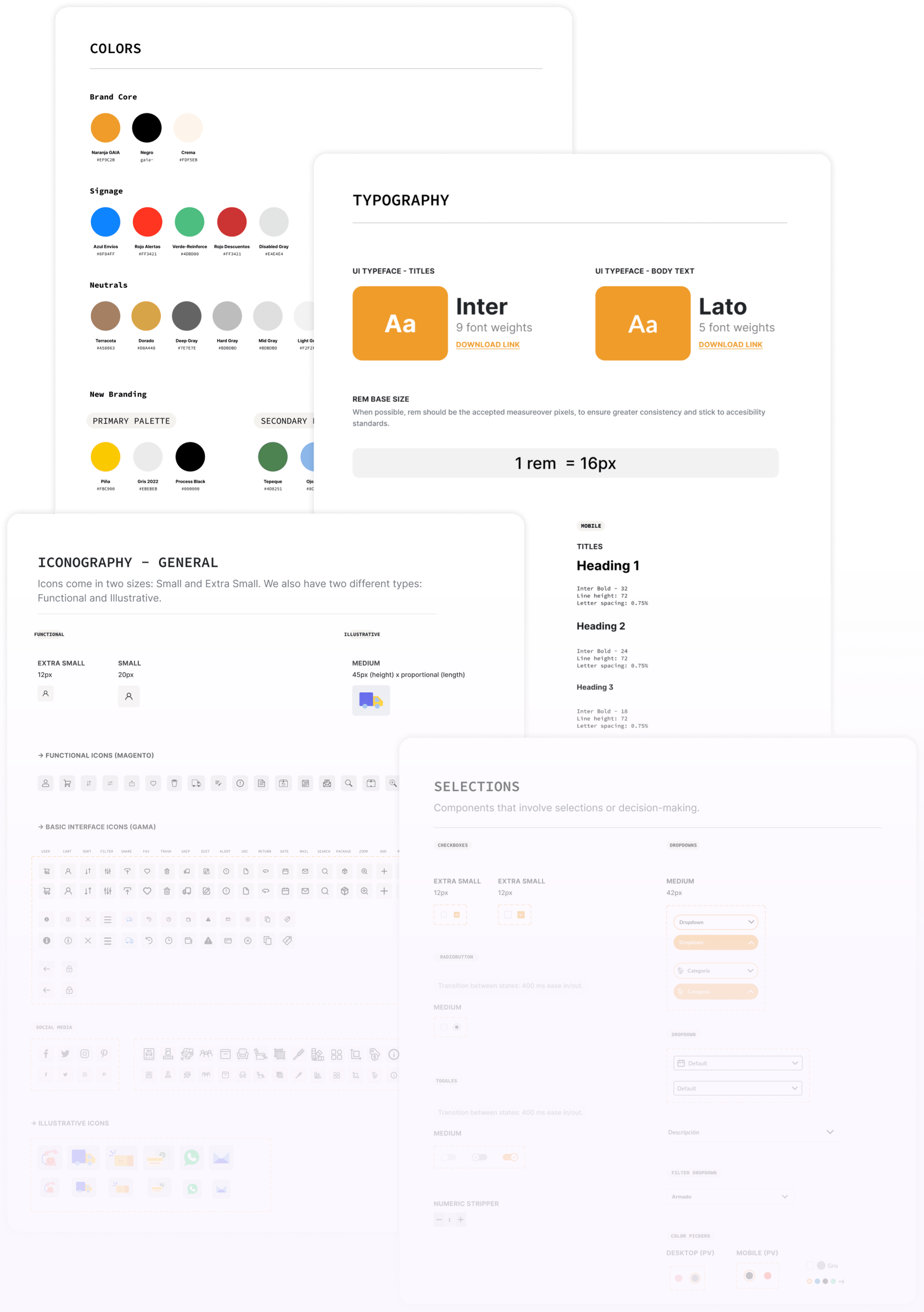
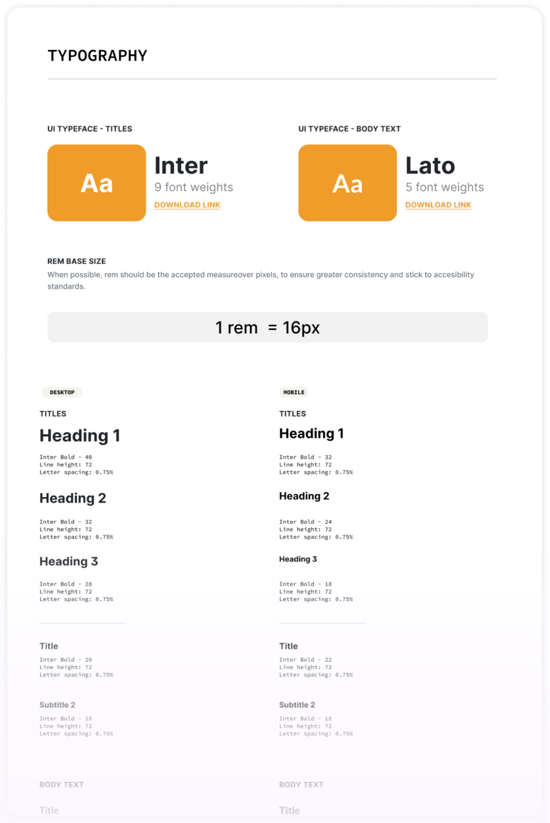
Typography
The font choices were defined as Inter for titles and Lato for body text. Same as buttons and icons, there was a copious amount of font sizes throughout the product and it was necessary to set the rules for a more clean experience.
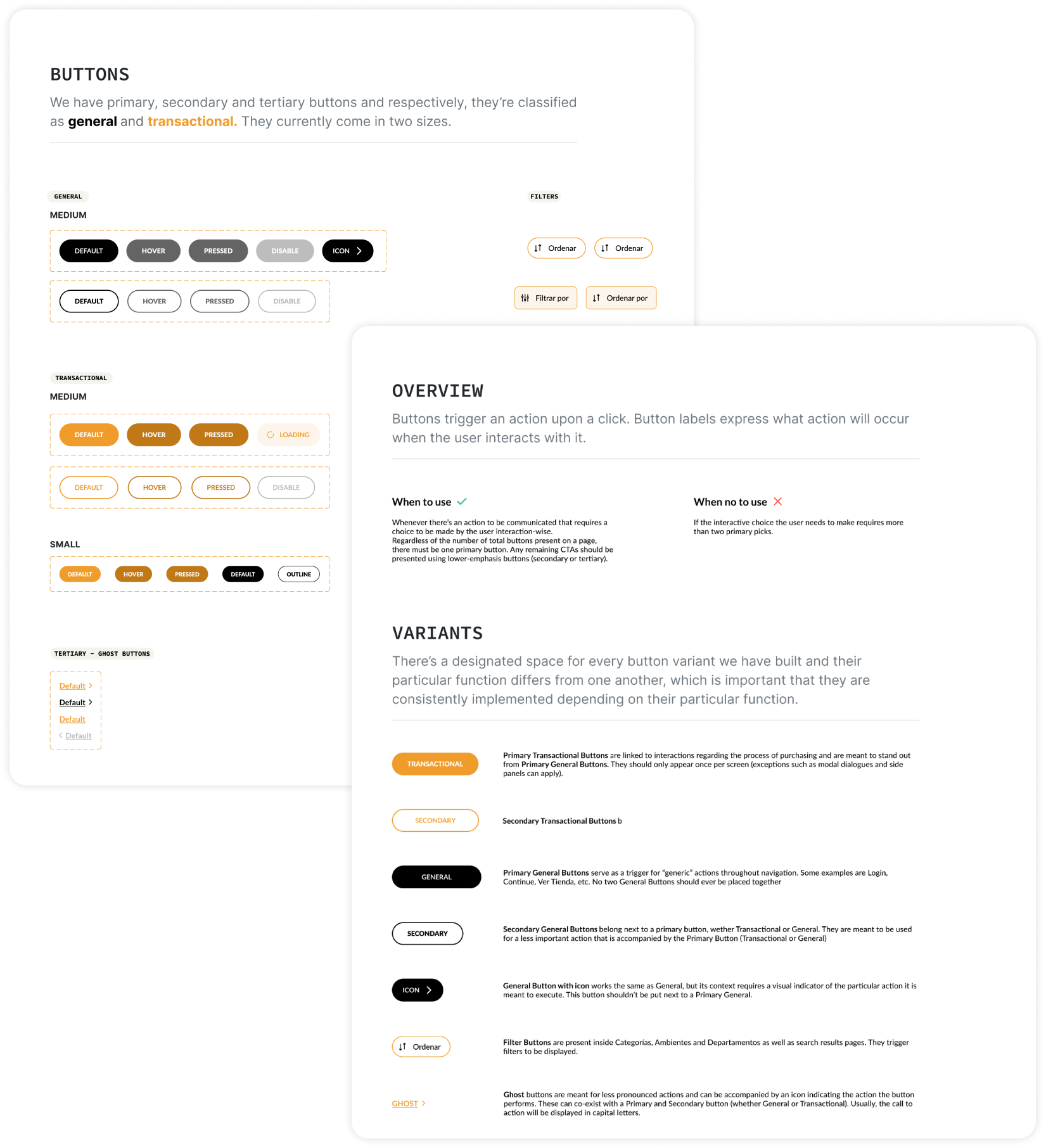
Buttons
Keeping up with two platforms was especially challenging with elements such as buttons. There were a plethora of colors, heights and even shapes co-existing together which could have been confusing for users when navigating so to finally set standards for them was a part of this construction, obviously.
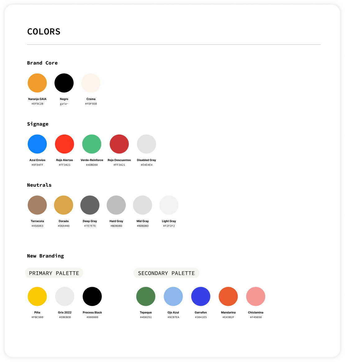
Colors
The talented Brand team had been working on developing an astonishing palette for GAIA’s new branding. We wanted to slowly introduce these colors into the interfaces and I also added some others needed for various states.
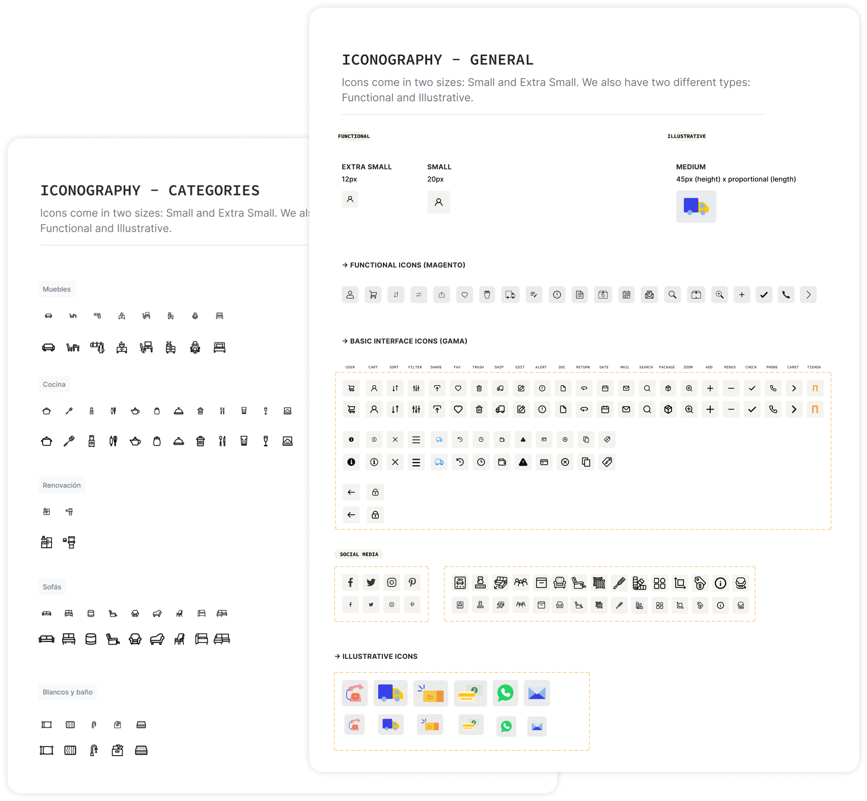
Iconography
As far as icons go, GAIA had different styles, widths and sizes throughout the digital experience which was very inconsistent.
As much of a great and time-saving practice it is to simply find libraries and use those, there are times when it becomes necessary to invest time in a custom-built library and because of the specific nature of the business, I also dabbled into icon design. I based styles off of Material Design’s icon grid.
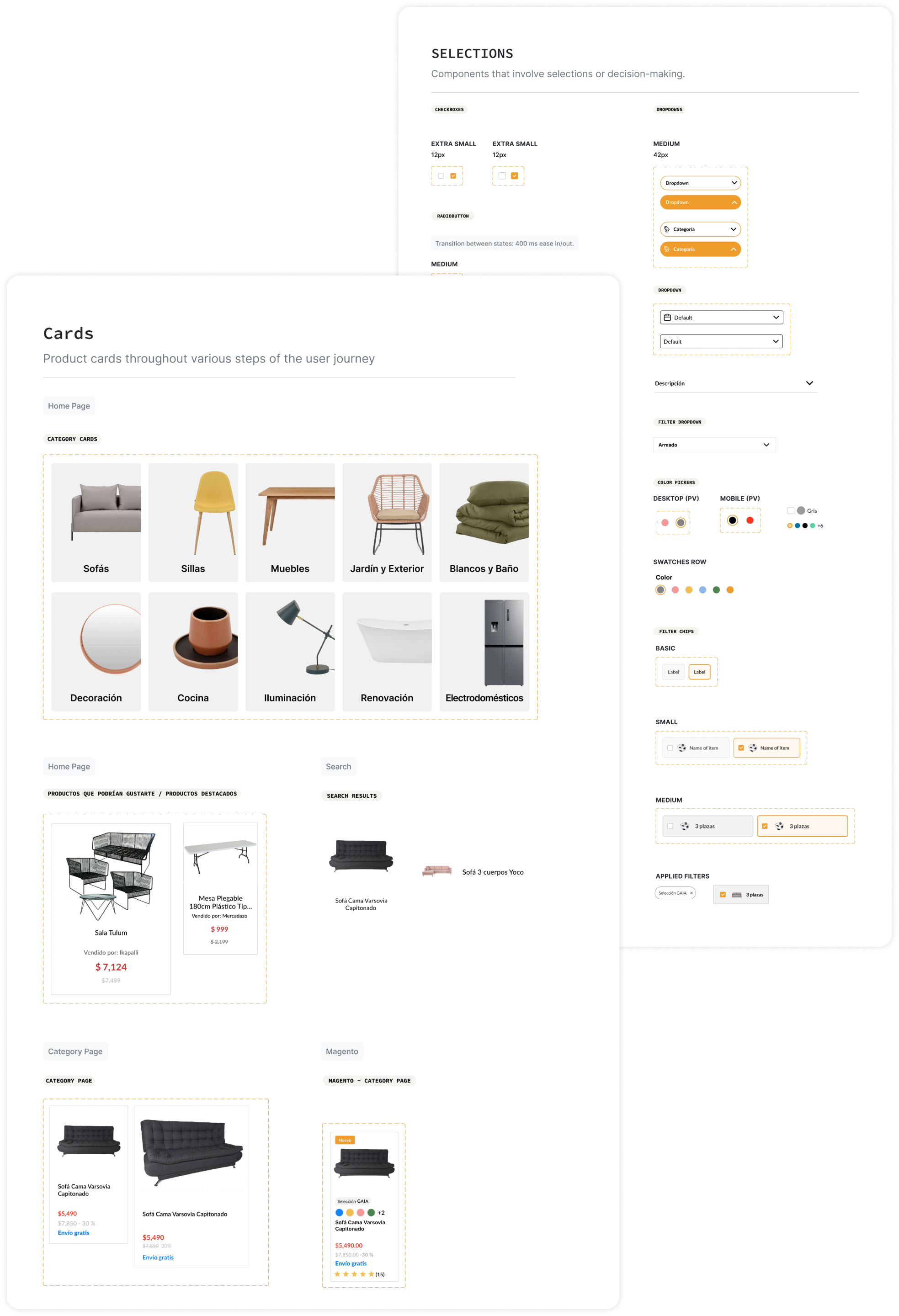
Selections, controls and product cards.
Though a lot of the UI elements were native to Magento and CS Cart, we put in the work to style them the way our team decided and we kept building on top.
UX & UI iterations
GAIA’s experience was split up in two funnels: Upper (Home, Category and Product Page) and Lower (Checkout, Cart and Success Page). I was in charge of the Upper funnel.
We ran AB tests all the time via VWO to better learn what users responded to best as well as which interactions were more helpful to convert. These AB tests were deducted through benchmarks and behavior patterns encountered in VWO. Here are some re-designs I proudly worked on:
📙 Catalogue segmentation
In order to provide a much more organized navigation experience, we wanted users to refine their search prior to being able to filter out or sort products.
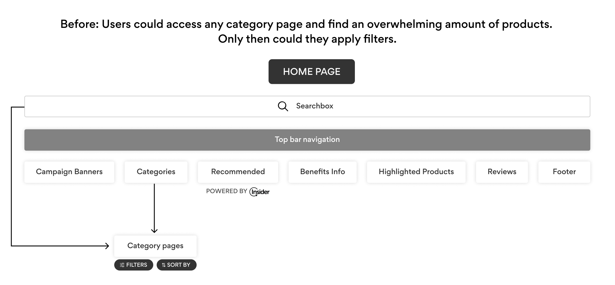
After: Users are now able to select the mother category first to then continue on to the ambient and lastly, the department, where they’ll get to browse in a more organized manner. After months of back and forth between the UX, Catalogue and Marketplace teams, the flow came down to the following:
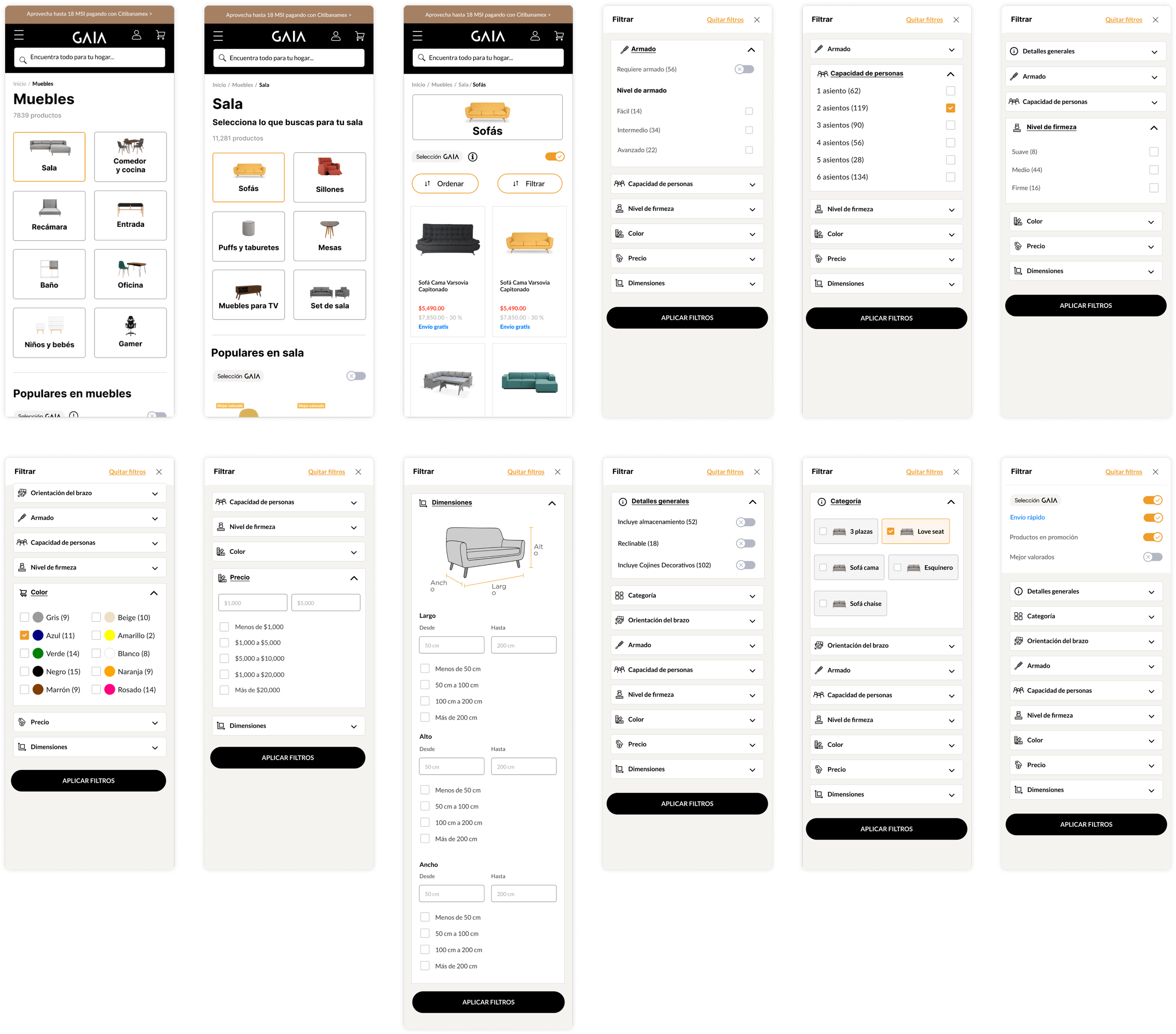
This resulted in a 21% increase of the Filter button click after narrowing down the search through the new flow and since deployment, though conversion numbers varied week by week, overall percentage of transactions appeared to have also increased by 1.2%
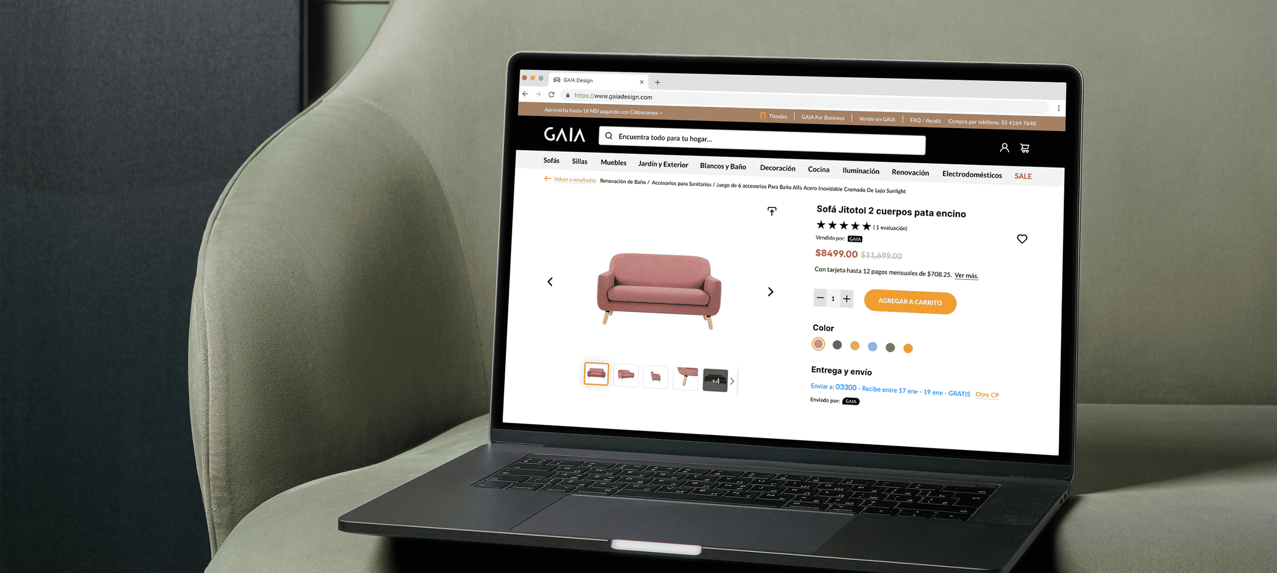
📙 Product Page
As far as iterations in the user experience go, I worked on improving the Product Page with the following goals in mind:


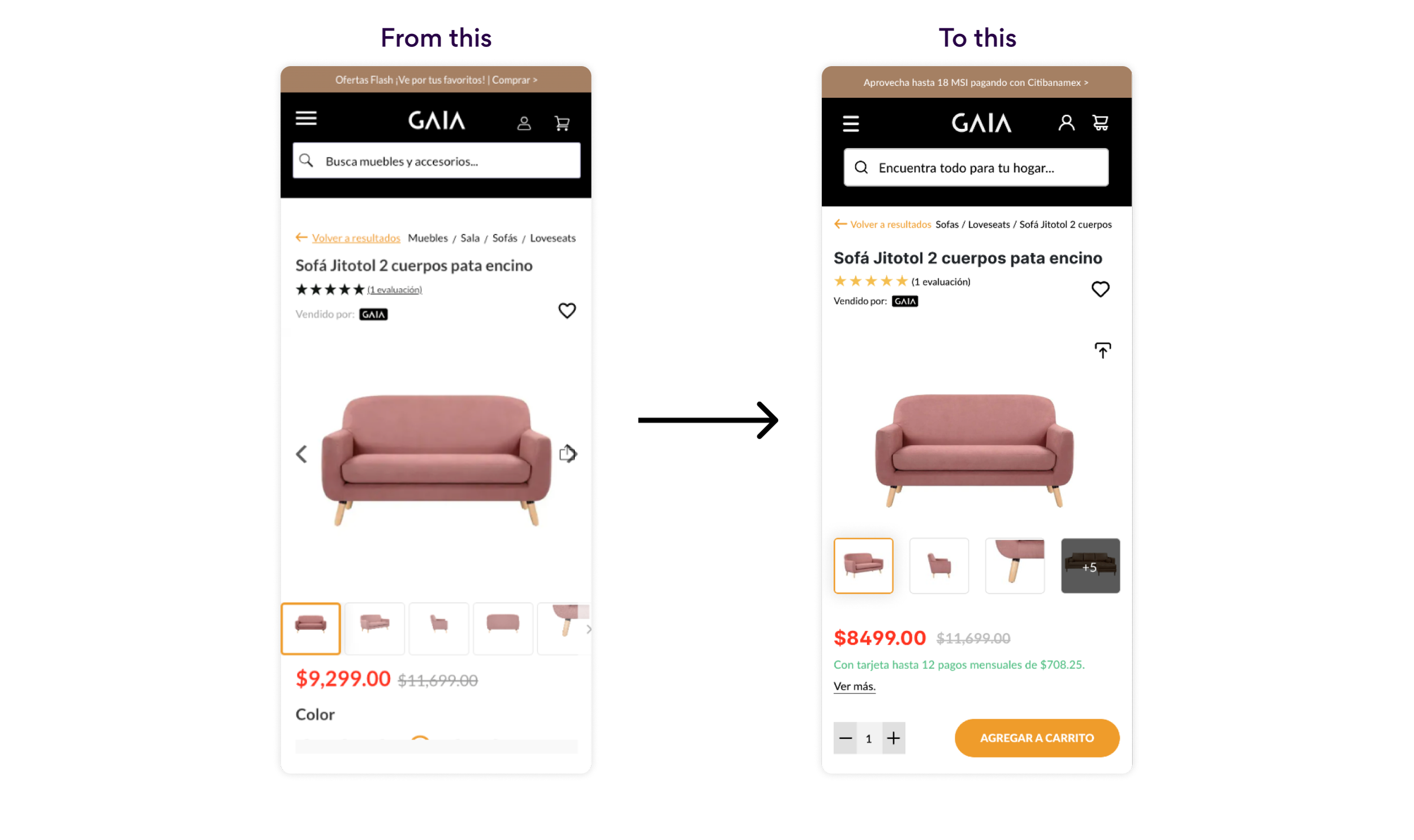
Other than obvious spacing matters, I aimed to increase the name of the product for a quicker eye-scan, reduce cognitive load by lessening the number of presented thumbnails and have both the numeric stepper as well as the “Add to Cart” button anchored to the bottom of the viewport at all times for users to interact more easily with the thumb zone. This approached performed best vs having to scroll all the way back, by an increase of 13% in clicks.
🛋️ Products’ new attributes
User surveys powered by Insider informed us about how important it was for customers to know details on furniture pieces when making a decision, which is what prompted the implementation of the “New Attributes” block: a digestible summary on each product easily accesible on our Product Page view.
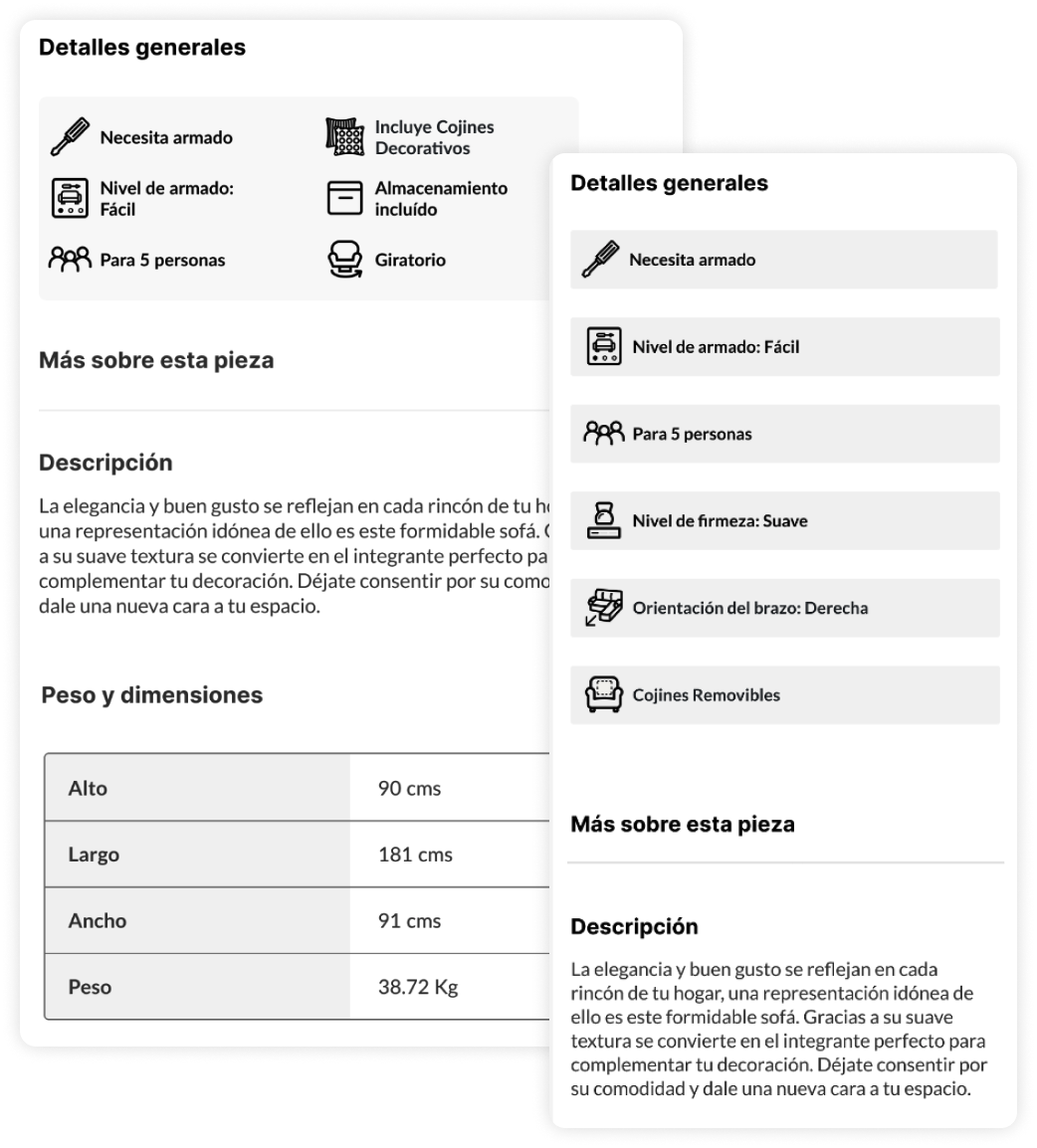
This new block of information aimed to inform about key attributes (as defined by the Catalogue Team) that varied by categories.
We launched this feature with Sofas and Chairs respectively first because those are GAIA’s best selling ones. I also developed custom iconography for visual support.
This is supposed to escale at all categories for the whole catalogue.
What I would have done differently
Advocate for user research and testing: I would have liked to listen to users in order to better understand their pain points and frustrations because we heavily relied on quick pre-made surveys that left little room for more in-depth feedback. The testing part was merely AB-oriented through hypothesis usually based off of benchmarks, but I would have loved to open direct channels for improving GAIA’s experience through becoming far more user-centered.
Have a work inquiry or want to go grab a coffee? Drop me a line at dianatormel@gmail.com ☕️
Thank you for reading! ✨