Launching a tech-driven Peruvian food virtual brand in the Bay Area.
With the concept of ghost kitchens and virtual restaurants on the rise, chefs Ignacio Barrios Jacobs and Patrick Whuking from Urban Kitchens decided they wanted to tackle the American market and bring Peru’s flavors to South Bay Area, and rightfully so, since the country happens to hold the World's Leading Culinary Destination award for the 10th year in a row.
While there are a few well stablished Peruvian restaurants in California, they seek to think outside of the box and cater to all tastes by building six different concepts revolving around Peru’s cuisine and overall Latin flavors…but they had a few concerns:
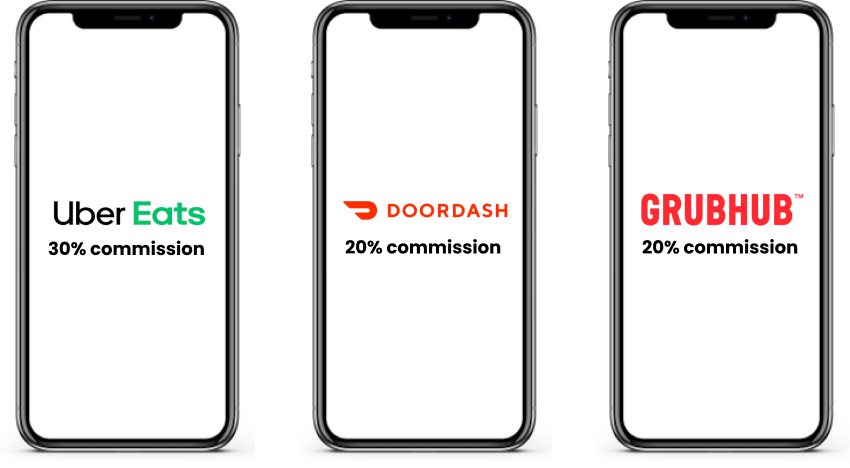
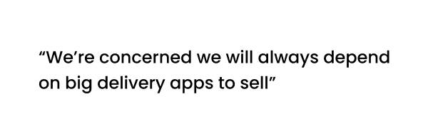
The existing delivery apps are a great way tool for virtual restaurants but they also can have high commissions, which isn’t too helpful for emerging businesses starting from zero.
As a result of this…

The solution for Peru Kitchen’s restaurants to have a voice and presence of their own.
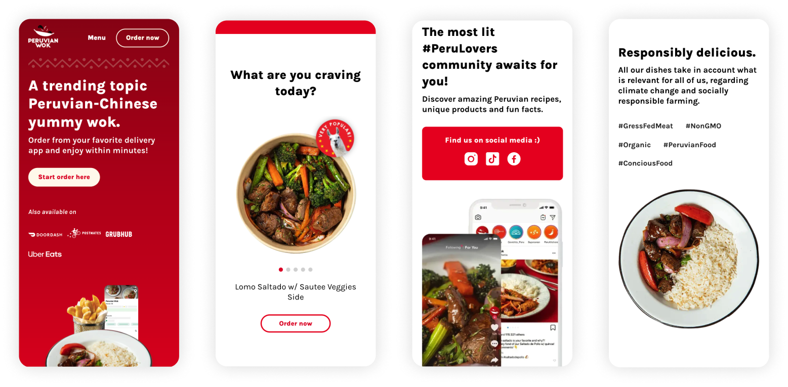
We developed a practical, scalable, reusable landing page format that is perfectly compatible across all brands, with various call to actions placed along to encourage users to place their order directly, with an easy-discoverable menu and invitations to join the community on social media.
We also created a smooth and seamless experience for the user to either place their order directly with us, or to visit the other delivery apps, should they choose the latter.
1) Research
Competitive analysis
What similar brands are there on the market?
How are they handling their technology?
How are they used?
What advantages do their own sites offer vs third party delivery apps?
2) Create
Brainstorming sessions
Wireframes
User feedback
High fidelity designs
3) Evaluate
Usability testing
Iterations
QA testing
Run metrics of CTAs
My contribution
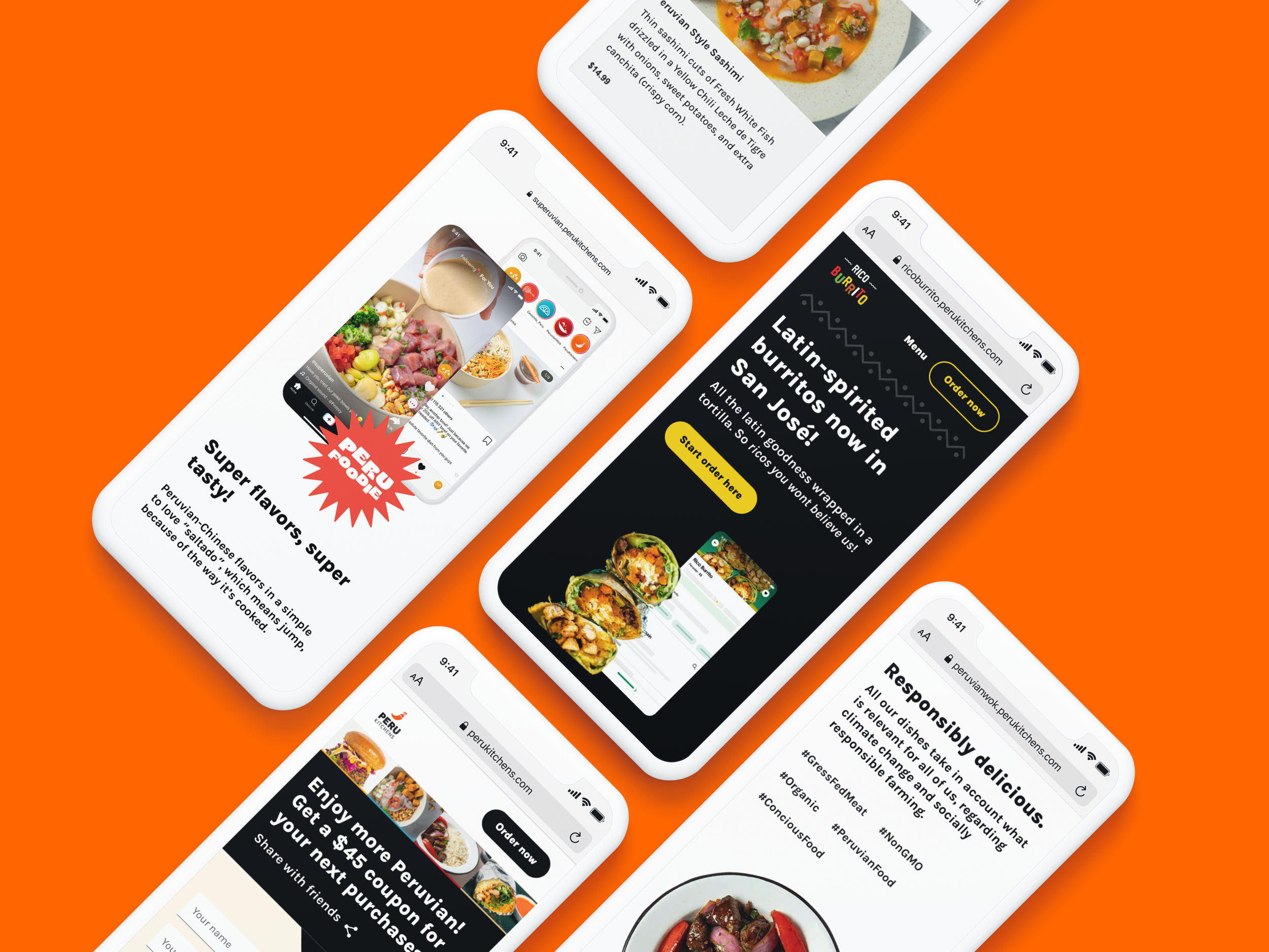
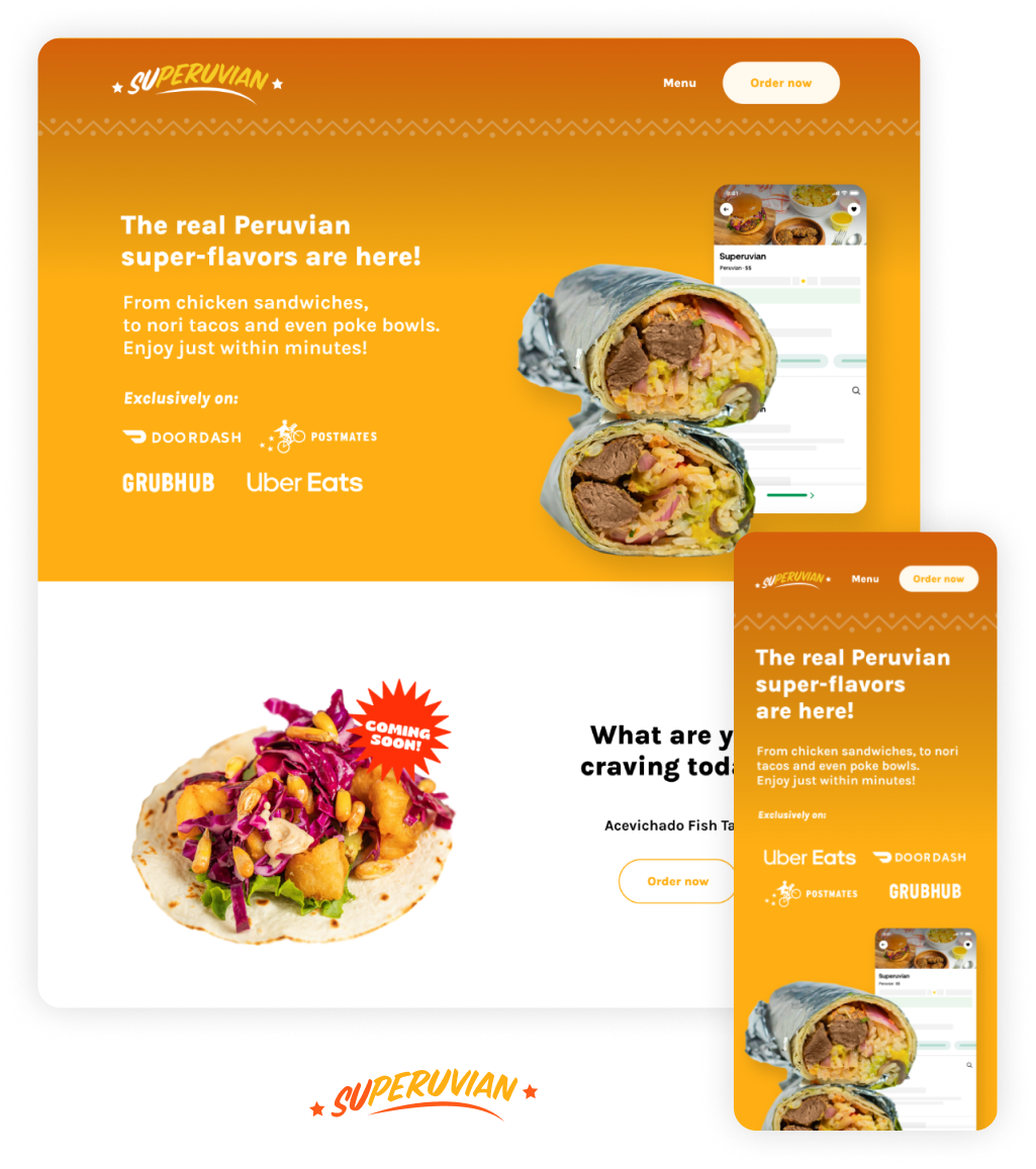
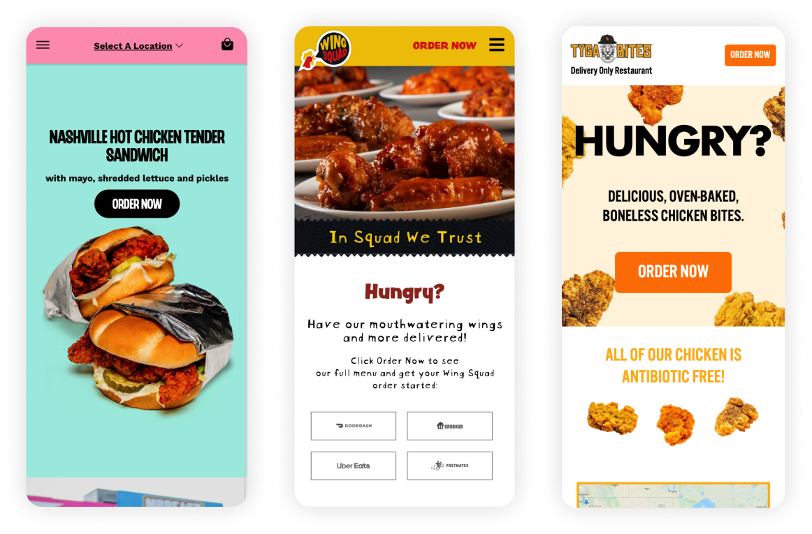
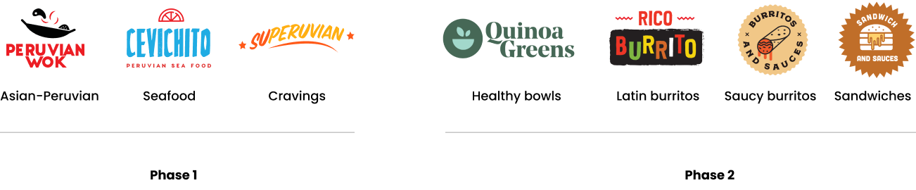
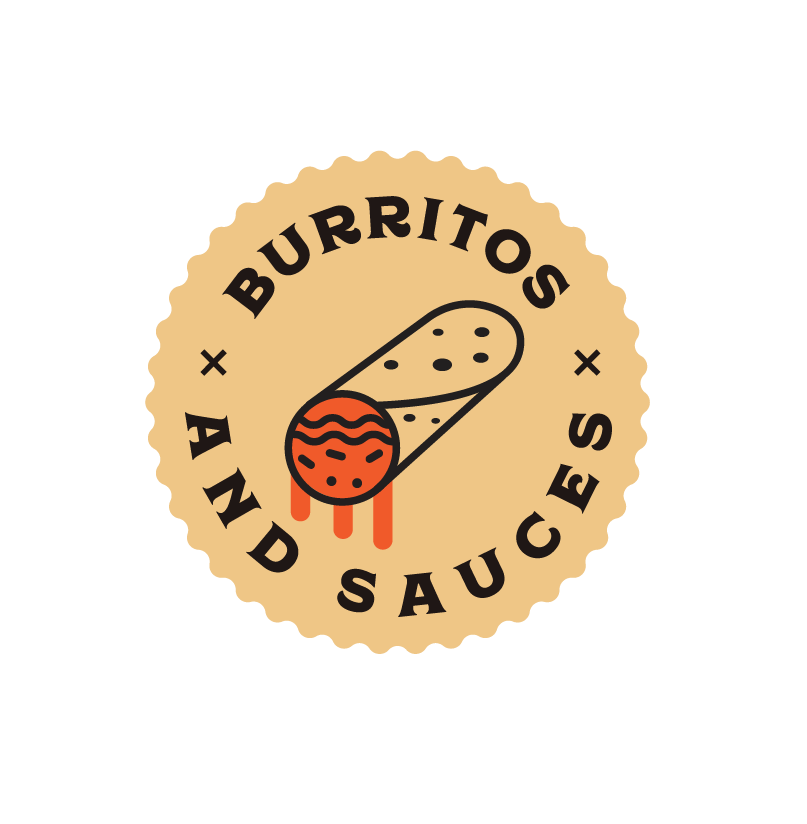
Along with the head of Product and UX, we first started developing the names and brand concepts for the first three proposals: Peruvian Wok (woks), Cevichito (seafood) and Superuvian (cravings) as well as each separate branding that felt in sync to live on a digital product. Eventually, other brands were added: Burritos and Sauces, Rico Burrito, Quinoa Greens and Sandwiches and Sauces.
When starting the first steps, I advocated for conducting user interviews to understand their needs when ordering online. (Target audience were Millenials and Gen Z)
We were responsible for brainstorming and synthesis sessions before jumping to solutions. I created wireframes, conducted interviews with users, gathered feedback, created high-fidelity designs, presented to the dev team and was in constant and close communication with them to make sure implementation was done properly.
Lastly, I also helped the entire team to do perform QA, report bugs and overall mistakes.
Competitive research
Key observations from competitors:
Operated by VDC, a company that specializes in the creation and development of virtual restaurants
Their landing pages are separate from the system they use for transactions (except for Mr Beast)
They also seem to have a base for each brand’s UI and elements are simply replaced to match the brand’s graphics
So we found that...
Having a layout that could work for any of Peru Kitchens’ brands would save a lot of time when implementing. Being a small startup always means you have to use your time and assets wisely. Peru Kitchens’ idea of starting off with 3 brands, and eventually expanding to more made it crystal clear that we needed to adapt an agile way of implementing designs and make it as practical and efficient as possible.
This would provide all brands with a sense of unity, visual coherence and take very few hours for developers to finish. This would also solve the identity and sense of “self” that both Ignacio and Patrick were looking for, as opposed to simply signing up on delivery platforms.
User interviews and research
In order to better understand how people interact with delivery apps and, especially, with built-in ordering systems from restaurants, I conducted user interviews to identify potential problems in their journey.
Us as product team (2 designers and 3 developers), also gathered with the rest of team to have affinity mapping sessions, so that all of us together, with the expertise of Patrick and Ignacio, could brainstorm solutions based on our findings.
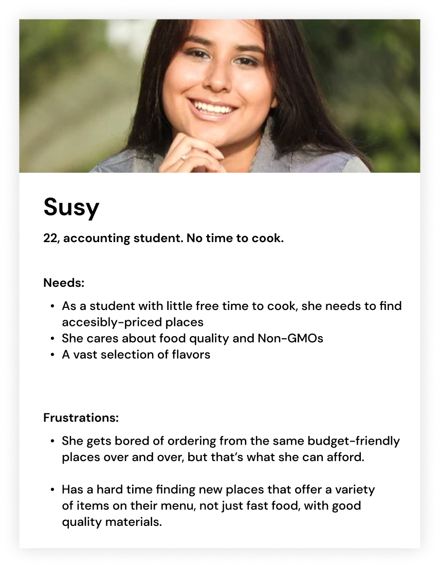
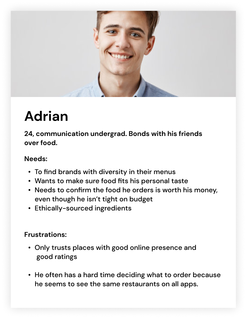
I interviewed 10 different people from ages 21 to 29 who are active buyers on delivery apps and built-in ordering systems. They don’t have enough time to cook for themselves or don’t know how to, so they heavily rely on digital products like Uber Eats and often prefer to order directly from the restaurant’s own option If available. The insights I got were the following:
They are most likely to order from places that offer discounts regularly
If available, they often prefer to order directly from the restaurant’s own option because they associate it with saving money
They’ll choose the option that is closer (distance wise), but are willing to allow heavy waiting times If they find cheap options
4 out of 10 showed concern for fraudulent websites from restaurants they’ve probably never heard of, but said finding their names on delivery apps made them more trusting.
These key points helped us to understand that users do feel inclined towards looking for other options for them other than the go-to delivery apps because they want what’s better for their pocket.
Qualitative personas
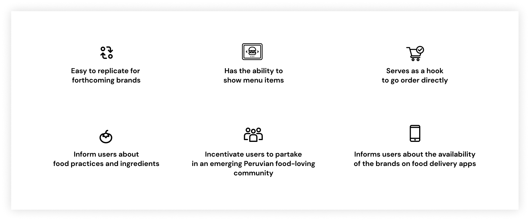
Design Basics
With my qualitative research findings and personas, plus the business needs from Ignacio and Patrick, the product team had to move rapidly and start creating some first approaches of the solution: a landing page base design that could work across brands with the core functionalities:
The food brands
Sketches and wireframes

User feedback
All interviewed users found the design easy to use, clear and simple. They loved that they could easily order directly from the website, browse through the menu, while also showing other delivery apps If they end up wanting to use those instead. They all loved being able to see the menu upfront, its variety and were also excited to find the sister brands so they could have even more options to pick from.
High fidelity designs
Speed is key inside startups, and we had to move quickly, so once we got positive feedback from Ignacio and Patrick I started coordinating with the development team for implementation to start happening.
For this very first iteration, our primary goal as a team is to validate whether or not users will actually prefer to order directly from the brands’ websites, while providing each of those with an identify of their own through color guidelines, branding, food photography, etc.
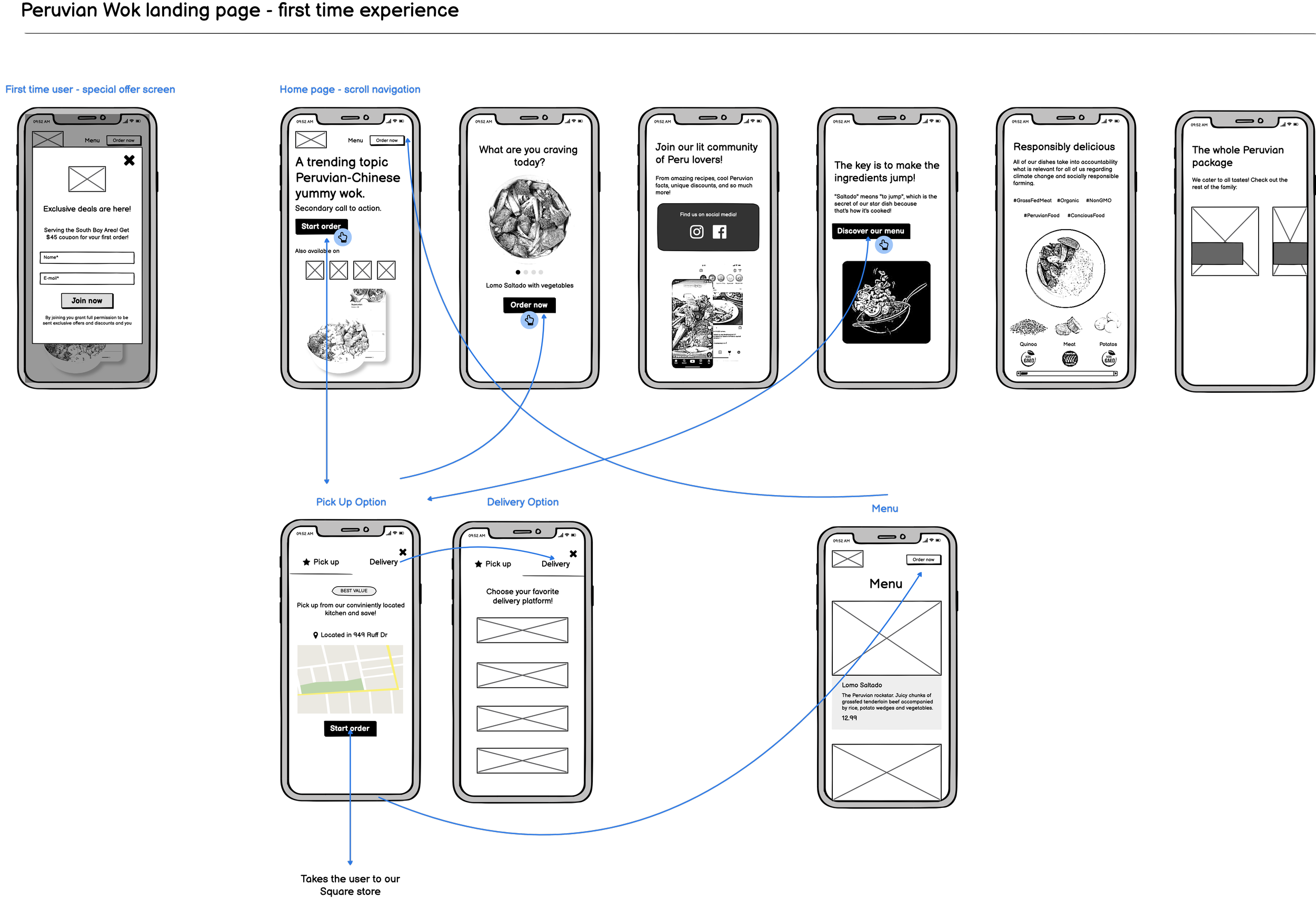
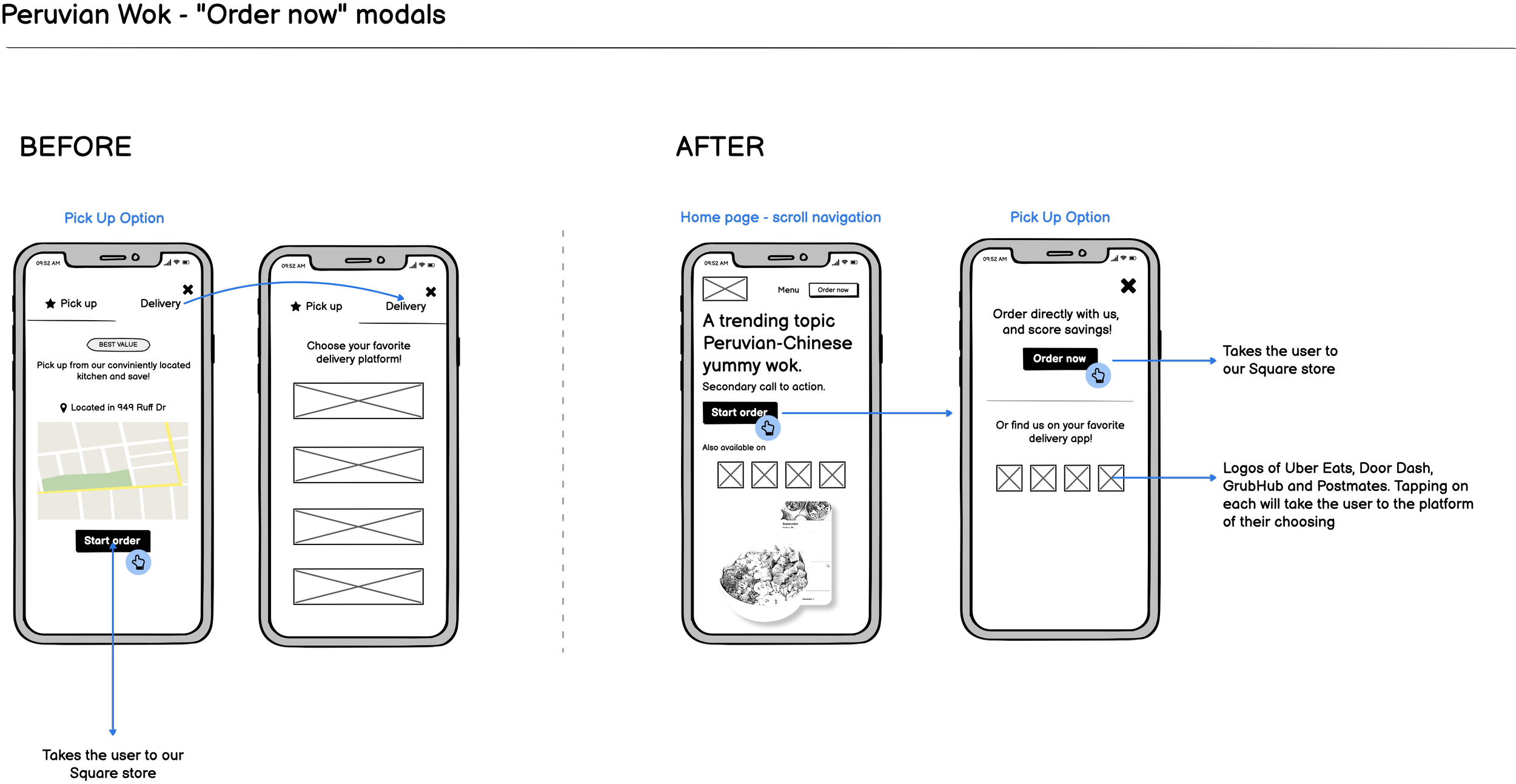
Landing page - scrolled for Peruvian Wok
Click on any logo to head to the real product:

Iterations
The only iteration that’s been needed so far, was changing the “Order now” modal displaying the “Pick Up” and “Choose delivery” tabs because Peru Kitchens started offering their own delivery service. This was a change requested by business side.
Side design requirements
As business started to get going, a few other tasks were requested to cover for two business needs:
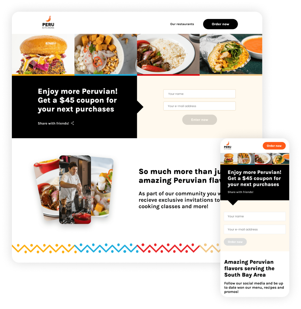
* A Peru Kitchens page that served as a landing destination from printed marketing materials and ads offering discount in exchange for their name and e-mail (soft sign up), presented all brands under the umbrella spectrum that Peru Kitchens consists of and mentioned their Catering services.
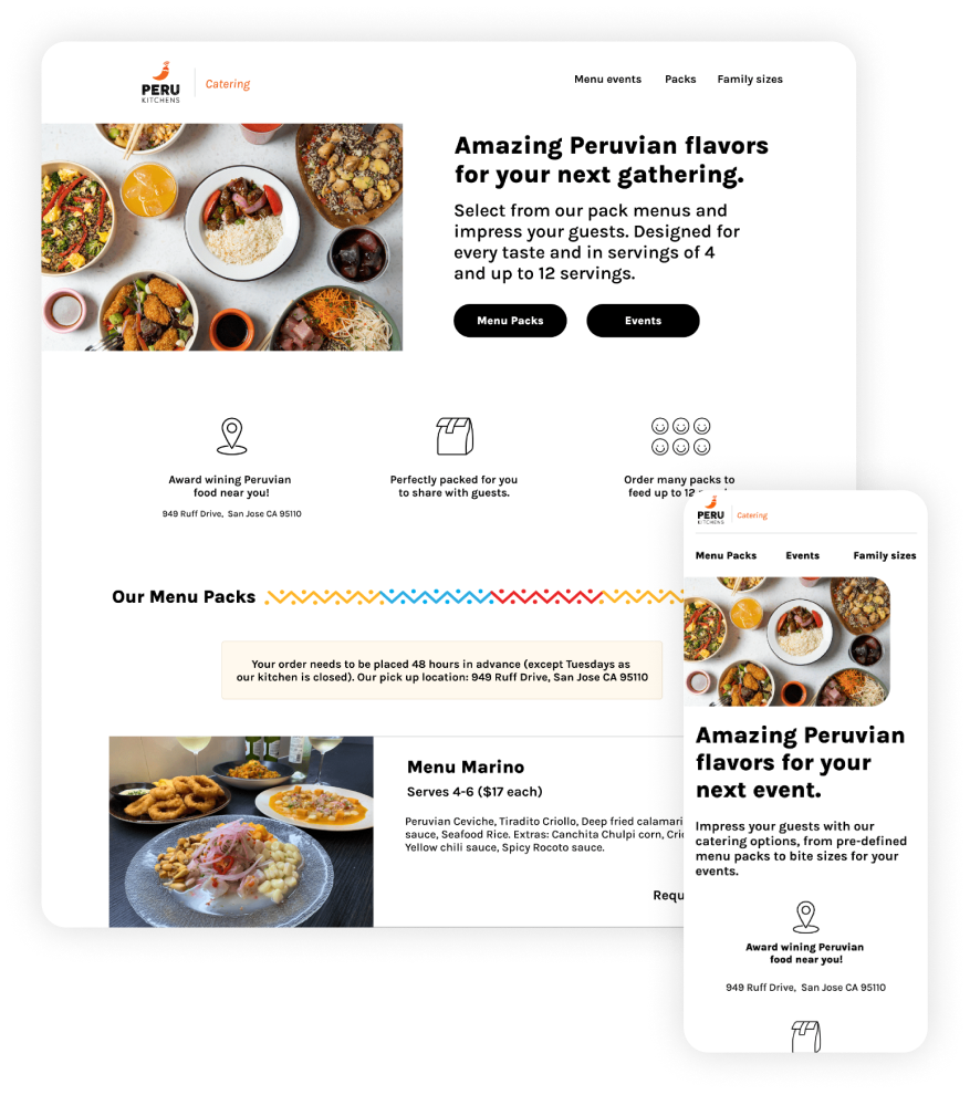
* A Catering page: Peru Kitchens decided to expand their services and start offering caterings for large volume orders. This one in particular had to be shipped in over 48 hours.
Future steps
Peru Kitchens keeps growing with new brands and flavors. They seek to eventually expand to new cities later this year which is why the foundations of all technology used throughout the product must be steady and ready to easily connect to any other third party app or system.
What I would have done differently
More diversity: I would have liked to have more interviews with more diverse users with similar habits but different ethnic backgrounds and professions, since I advocate for inclusivity and diversity, but a big challenge for small startups is always time and speed.
Food research: The effort put into research was mostly put into the competitive analysis and finding out how do similar brands handle their technology. Even though the actual menu and dishes were created by Patrick, I would have liked to dive deeper into understanding what types of food are Gen Z’s and Millennials based in the Bay Area interested in experimenting.
Have a work inquiry or want to go grab a coffee? Drop me a line at dianatormel@gmail.com ☕️
Thank you for reading! ✨