

Re-designing Walkie Talkie’s UI for a more engaging and delightful experience
ROLE
UX / UI Designer
YEAR
2021
CLIENT
Picslo Corp
COUNTRY
France
OVERVIEW
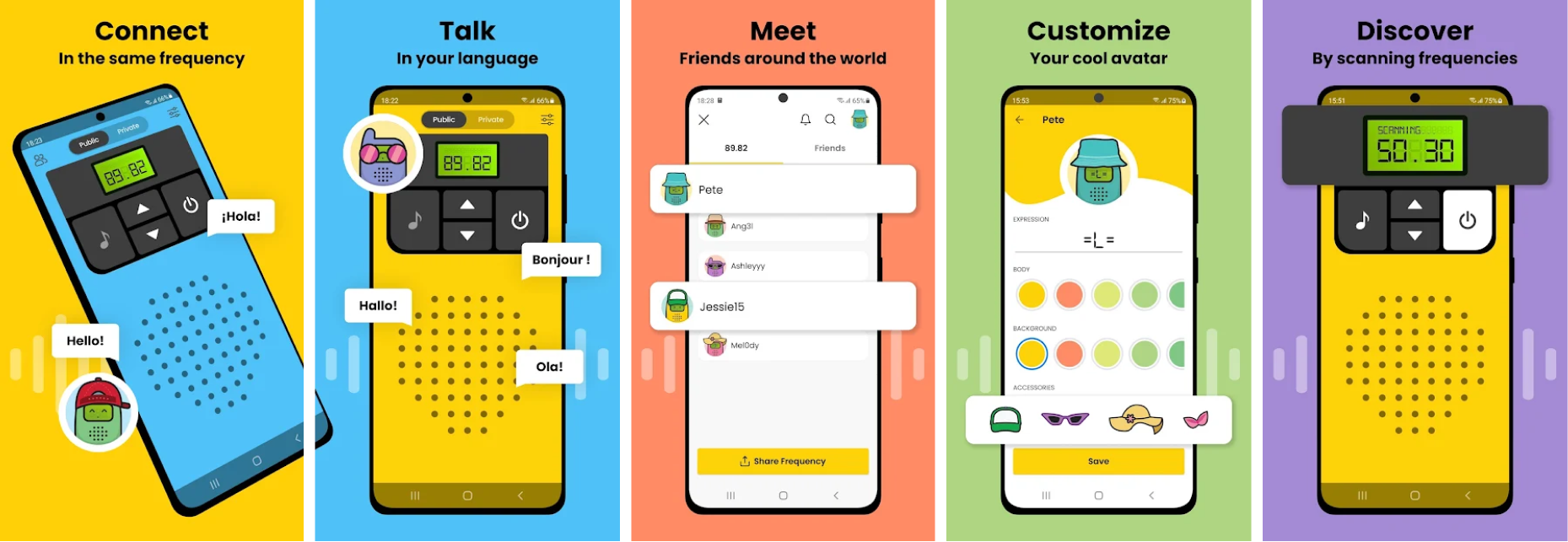
Walkie Talkie is an app that allows you to communicate with people from all the over the world emulating the retro two-way system from actual walkie-talkies. It is available in 6 languages and anyone can join both public and private frequencies.
The app’s core feature, are high fidelity audio frequencies combined with real-time communication. Developed by former Dolby-audio engineers, the app makes use of Dolby.io with active noise suppression for crowded environments, spatial audio that separates overlapping voices, and optimized device capture for clearer sound.
Walkie-Talkie is more than a communication app, it's a place to hang out with friends, meet new people, and discover creators. One very remarkable thing about Walkie Talkie, is the fact that the growth of its user base has been entirely organic.
Walkie Talkie is live and available for download on both App Store and Play Store
Problem
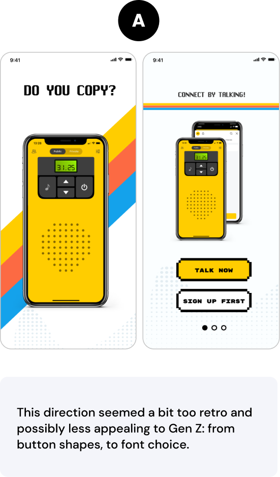
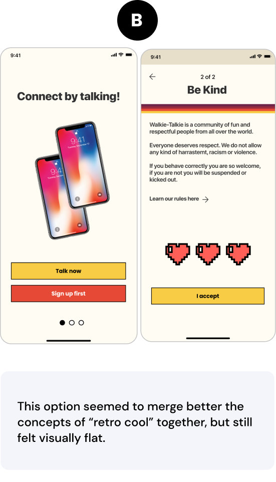
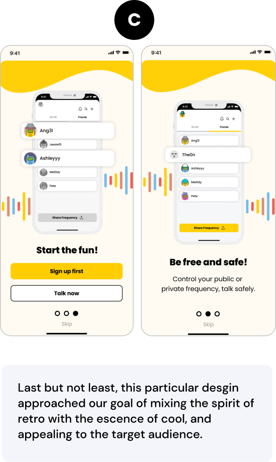
Walkie Talkie’s old UI wasn’t suitable for their target audience, it felt too stale and dull.
Goal
To increase user retention and delight past users with an easier to use, more appealling interface.
Scope and constrains
Mixing the retro concept of the app with “modern cool”.
My Contribution
I helped to re-design the UI of Walkie Talkie, conceptualizing a whole new visual direction for the app, because the previous one was struggling with user retention.
Taking the concept of “retro cool” and translating to an interface design that showed the best of both worlds for the target audience (Gen Z), was the top challenge.
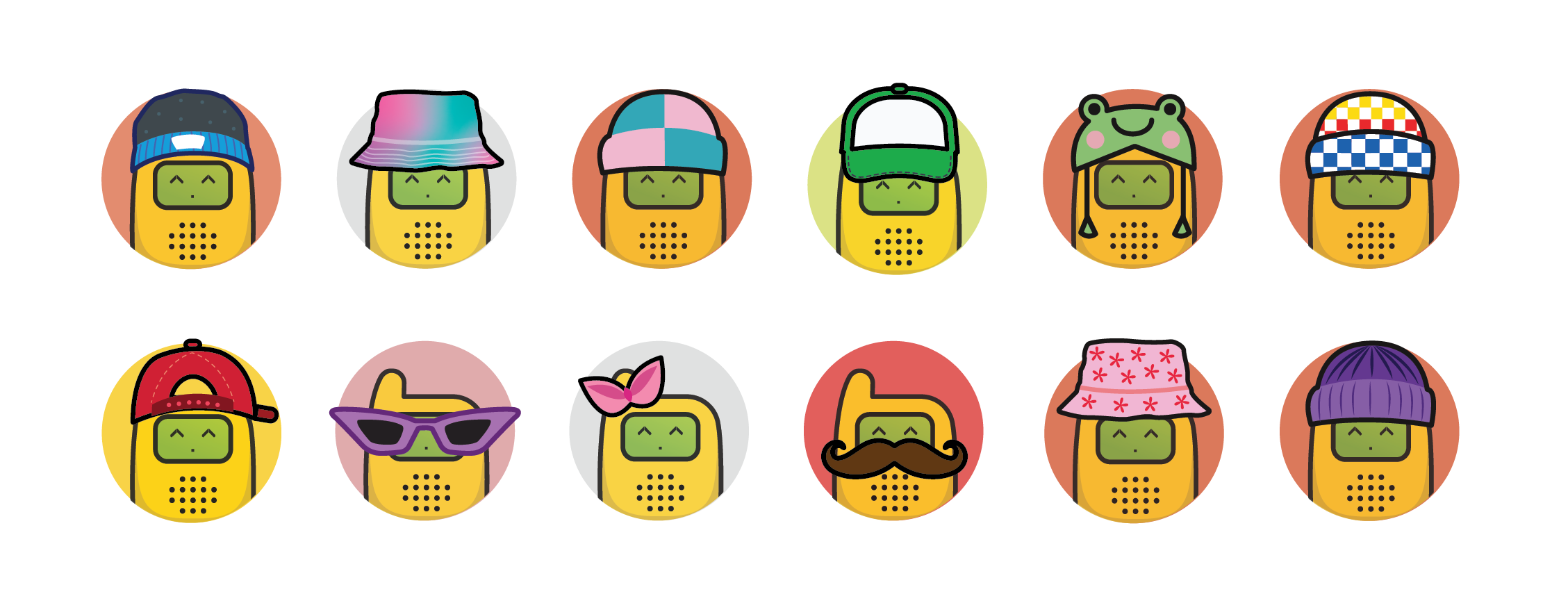
As an extra, I also created a series of accessories for the users to personalize their avatars and make the experience more enjoyable and fun, which were inspired by real-life fashion worn by Gen Z.
Walkie Talkie’s Old Design:
Research and insights
We first started with a visual research of the “retro cool concept” by putting a mood board together displaying graphics evoking the visual style we were going after.
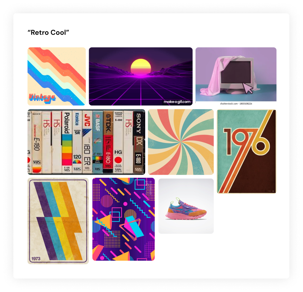
The mood board summarized a cheerful color palette, fun shapes such as waves and spikes, and a vibrant feel to it.
The new UI needed to have these three core elements very present mixed with a modern sleek look because it was important to steer away from looking like an outdated app for Gen Z users.
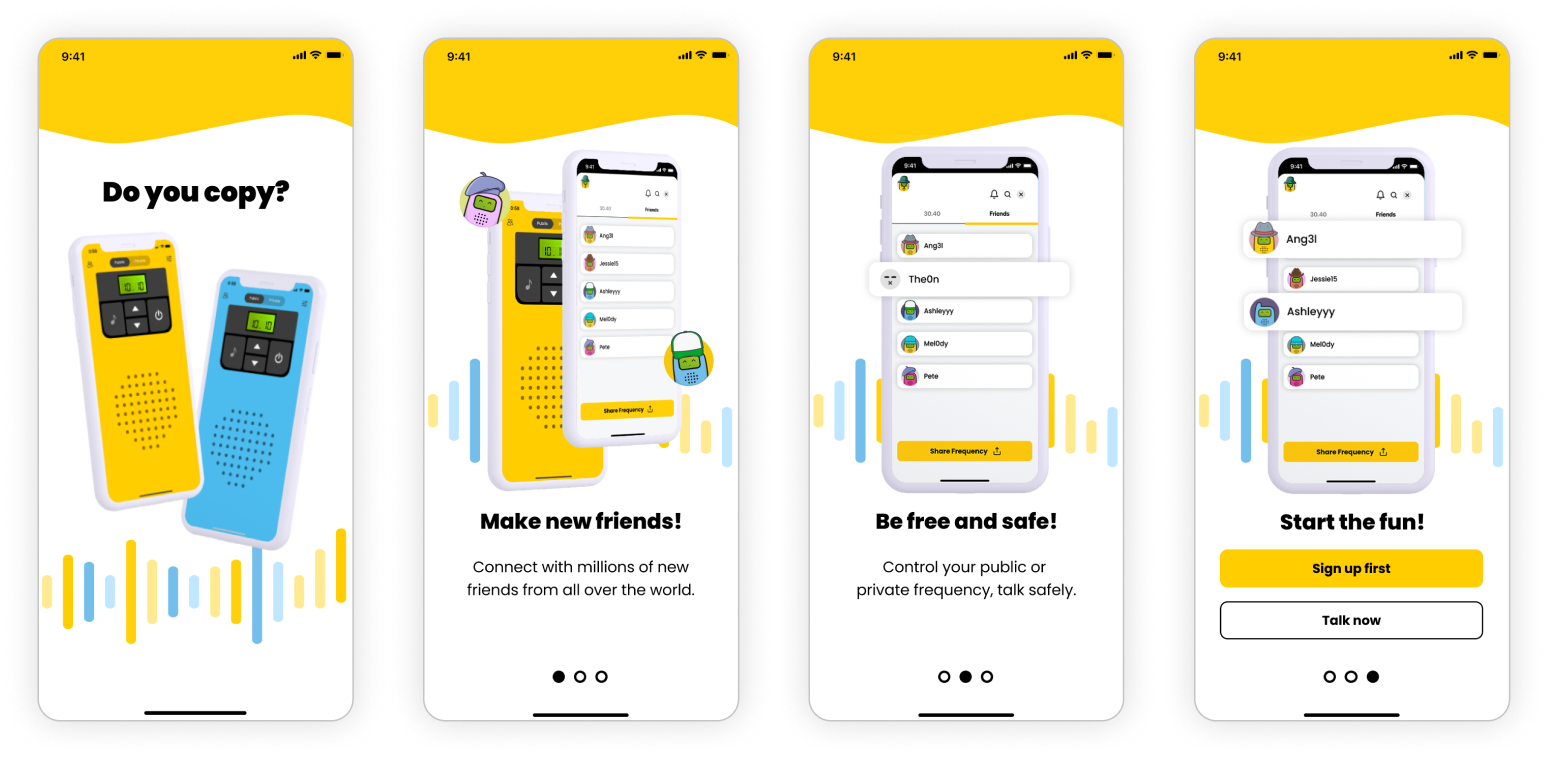
Exploration
The first task needed for the app, aside providing it with a new visual style, was the onboarding, which was something that the previous version was lacking. Users had to explore the app in order to find out how to use it. During interviews conducted by the founders, users kept asking for a “first time guidance tour”
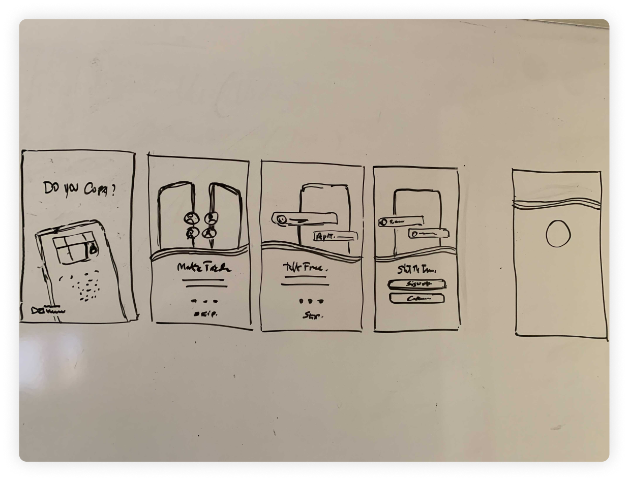
The onboarding needed to convey:
The possibility of talking to new people
The need to sign up for the full experience
Conduct code
Visual approaches
Design Outcome
For the final design, I picked the elements from each version and produced the final visual approach,
with yellow waves translating into a vibrant, cheerful, eye-catching top part, continuing to waves representing the presence of sound
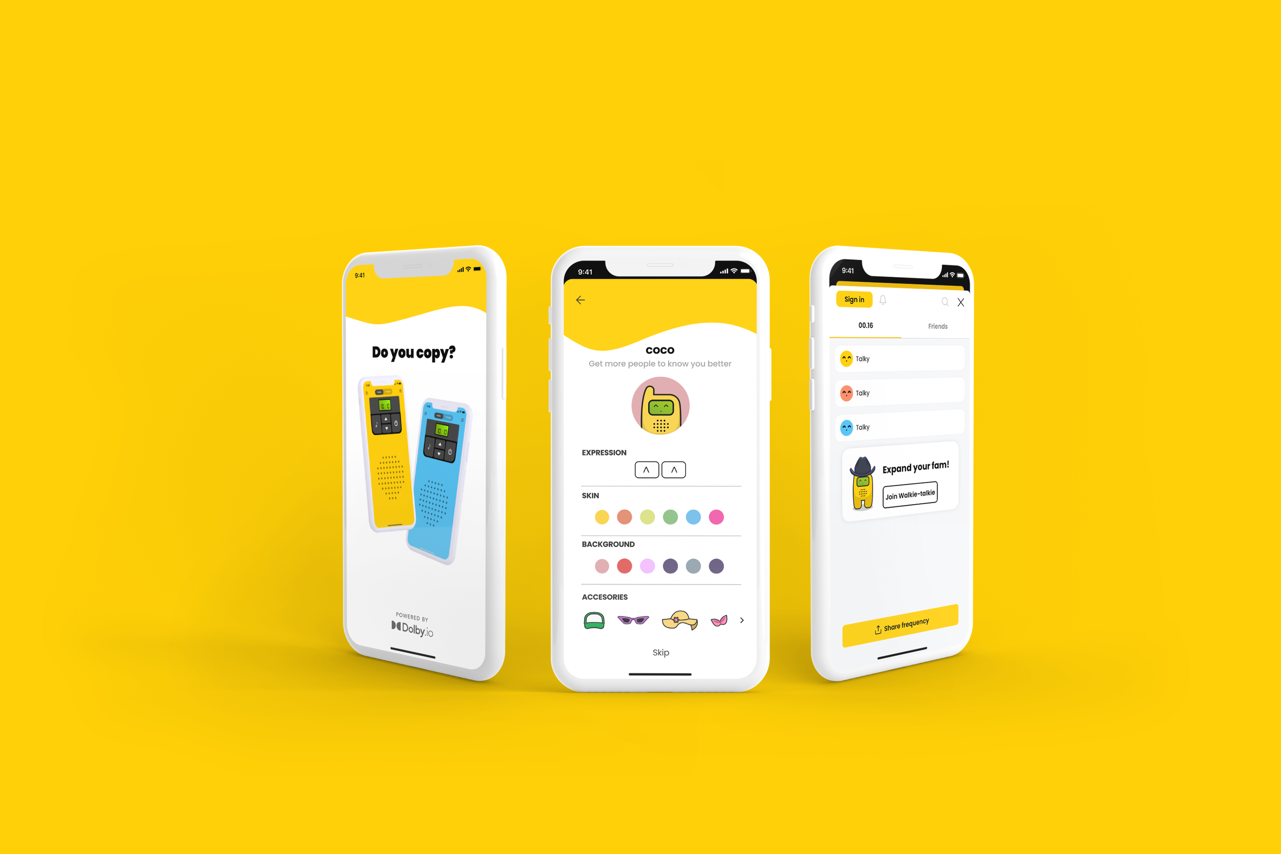
Onboarding
Sign Up
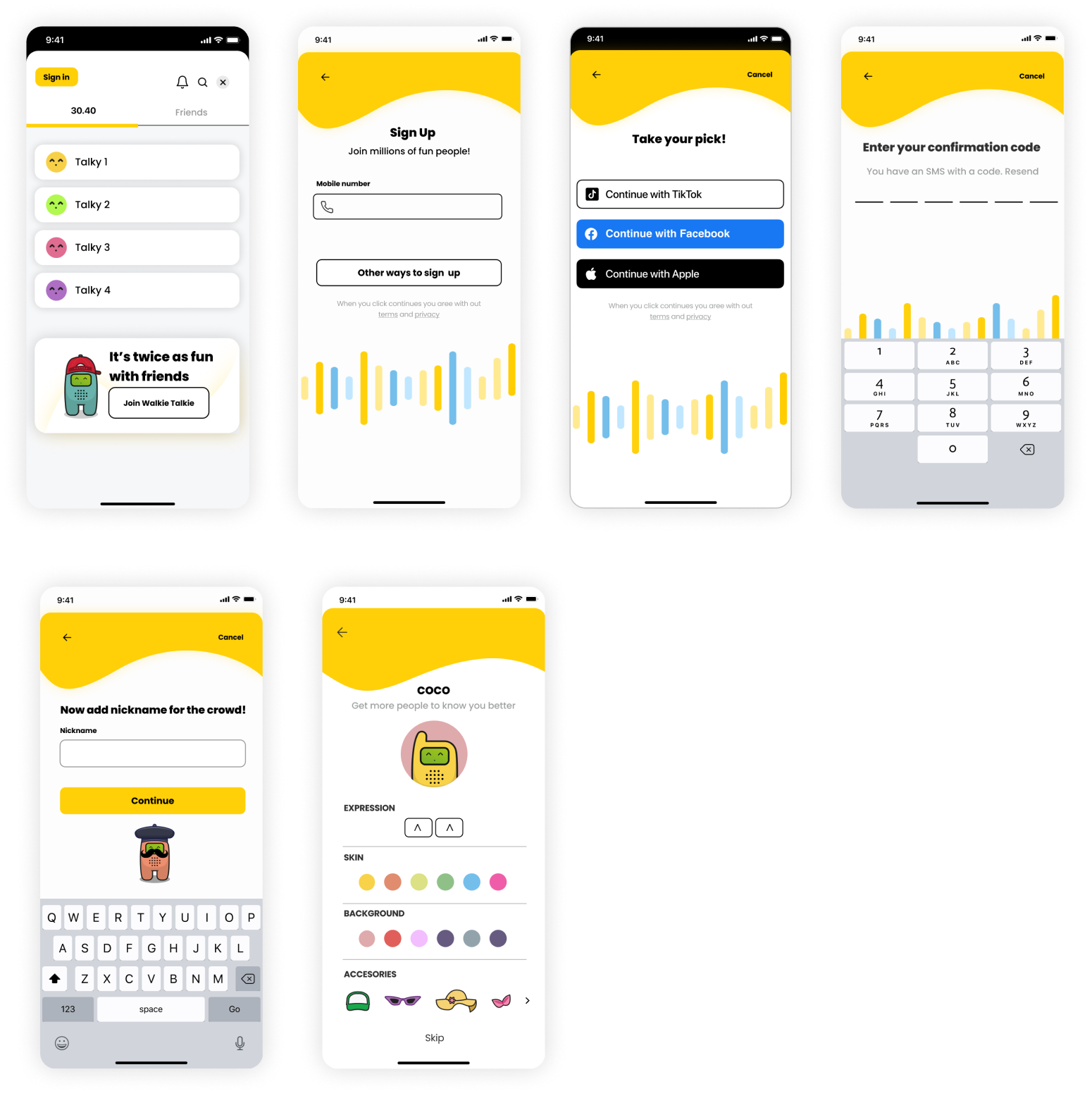
Gamification
To customize the users’ experience inside the app, a series of stylized accessories inspired by Gen-Z’s fashion were also illustrated by me, though tout to fit the universe of “Talky”, the app’s mascot.
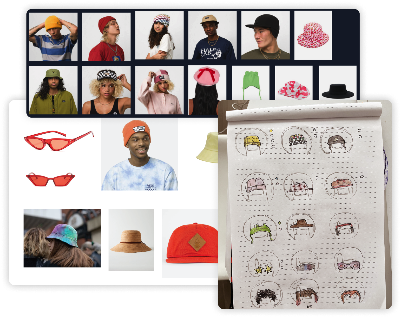
Accessories samples:
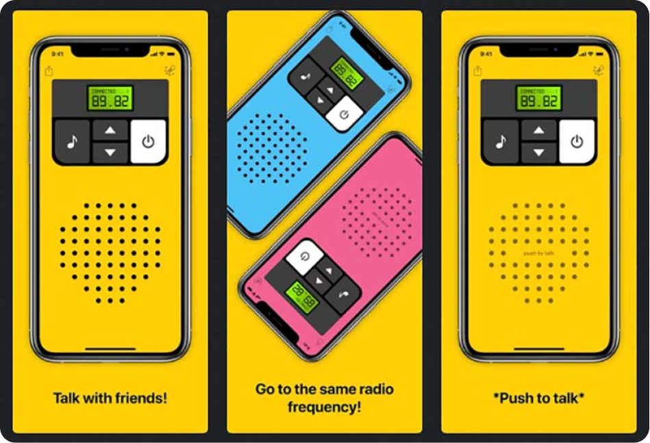
Google Play Screens
Takeaways and final notes
Helping provide Walkie Talkie with a new interface design that met a middle point between “retro” and “cool” was a big challenge because those two concepts are pretty much opposites, while also yellow being the predominant on-brand color that we needed to preserve.
This project was done within a relatively short amount of time, but this doesn’t mean our UX and visual exploration wasn’t thorough and very well thought-out.
I’m still in contact with the lead designer who helped me shape the visual direction and we will most definitely be working on more iterations in the near future.
Have a work inquiry or want to go grab a coffee? Drop me a line at dianatormel@gmail.com ☕️
Thank you for reading! ✨
Up next!
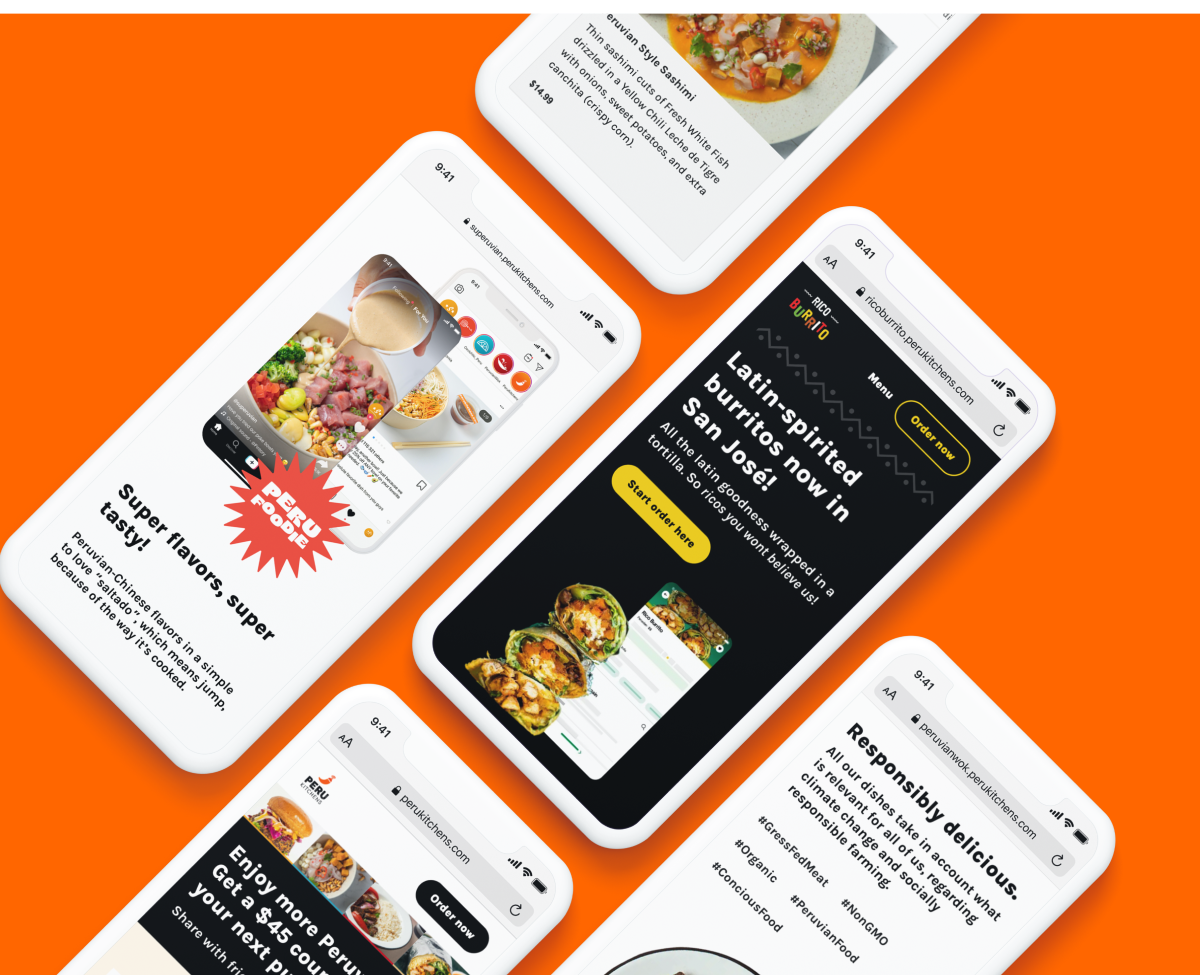
Peru Kitchens
Bringing Peru flavors to the US market
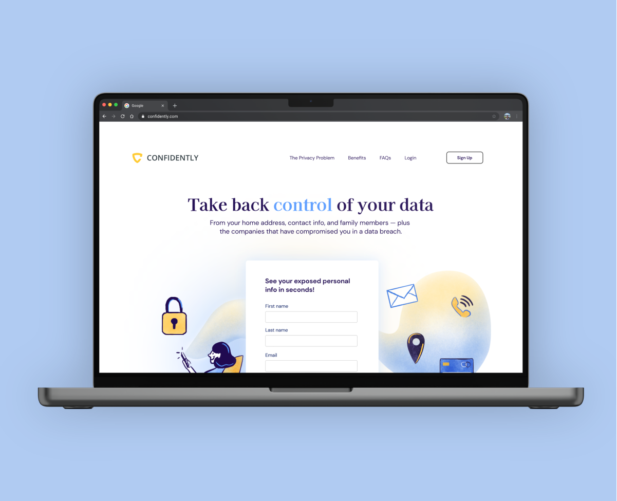
Confidently
Making it easier to get back control of your personal data